
How do you convert a photo to a riso print? Step-by-step explanation
- 6 mrt
- 4 minuten om te lezen
Besides converting illustrations into beautiful colored riso prints, you can also do this with a photo. It creates a tangible, colorful effect that you simply can't achieve with a regular printer. The colors are more intense, the grid is visible up close, and small shifts between the layers make each print unique. In this blog post, I'll explain step-by-step how to do this in Photoshop or another program with a channels function, such as GIMP or Affinity Photo.

What do you need?
You'll need an image editing program that uses CMYK color mode and has a channels function. Photoshop is the most commonly used, but GIMP (free) and Affinity Photo also work well. You'll also need a photo or illustration you want to riso print, and access to a riso printer.
Step 1: Create a new file in CMYK
Open Photoshop and create a new file in the size you want to print. A3 is easiest because it gives you plenty of room to play with. The most important thing in this step: choose CMYK as the color mode. This will ensure you can separate the colors properly later.

Step 2: Place your photos
Place your photo in the new file. You can also place multiple photos, or the same photo multiple times if you want to print them smaller. This also prevents paper waste. Always ensure a white border (margin) of at least 3 mm around your design. The riso printer doesn't like printing close to the edge, which can result in dirty or cut edges.
I decided to create a fun collage with mostly pictures of rabbits. This way, I can really showcase the impact of the print! You could also use more homemade illustrations and elements in combination with photos. Besides the rabbits, I added some abstract illustration swirls and dots in pink for some contrast and to add some depth to the print.

Step 3: Add color to illustrative elements
When adding additional illustrative elements, use a pure CMYK color so it separates well later. For pink, use Magenta at 100% (#FF00FF) and the other colors at 0%. For blue, use Cyan at 100% (#00FFFF); for yellow, set yellow at 100% (#FFFF00); and for black, set Black at 100% (#000000). Any color in between will work, but pure colors give the most predictable result.

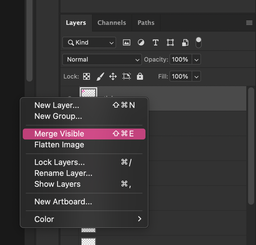
Step 4: Merge Layers
Once you're happy with your photo(s) and their composition, you need to merge the layers in your file. Do this by right-clicking on the layers and selecting "Merge Visible Layers." This will merge all the layers into a single layer.
Step 5: Split channels
Next to the Layers panel, you'll find the Channels panel. Click on it and, on the far right, find the icon with four small lines. Select "Split Channels." Photoshop will now automatically split the CMYK colors and open them as separate files: one for Cyan, one for Magenta, one for Yellow, and one for Black.
Double-check that the splitting went well. In the Magenta file, my pink illustrative shapes should be completely black and not visible at all on the other channels. If that's correct, everything is split correctly. You can still make minor color corrections on each channel if you want a brighter color, but that's not necessary. The end result is always a surprise!

Step 6: Save as PDF
Save each individual channel file as a PDF. This is the file format that the riso printer handles best and produces the sharpest results. I always print with Adobe Acrobat because it has many settings, but any PDF reader will work.
Step 7: Print order - always from light to dark
The printing order is important: I always start with the lightest color and finish with the darkest. For CMYK, that means: Yellow first, then Magenta (fluorescent pink), then Cyan (aqua), and finally Black. The black layer isn't always necessary, by the way. A CMYK print without black can also be very beautiful and saves drying time. It's also fun to replace the black, or one of the other colors, with a different color. For example, you could use orange for yellow, or green for blue. This creates a fun, quirky, colorful print. Feel free to experiment!

The end result
I ended up printing all four colors, and the result is exactly what I'd hoped for: the illustrations are bright and vibrant, the photos are sharp, and up close, you can see the beautiful grid of the riso printer. A few millimeters of offset between the layers makes it extra interesting.
And yes, I also had two misprints where a few layers had shifted. But that's the fun of riso. Those mistakes are part of the process and make each print unique. Studio Misprint isn't called that for nothing!


Want to try it yourself?
Photo riso printing is also a topic of a workshop. If you'd like to try it out yourself without having to learn Photoshop first, you're welcome to visit our studio in Utrecht. This will also be covered in our digital courses. Check the workshop page for current offerings and book your spot!