
Three ways to prepare your layers for risograph printing
- Jun 2
- 11 min read
You can often recognize Riso prints by their bright colors, texture, and sometimes slightly skewed layers. I like to use it to add more texture to a digital design and, above all, to bring it to life. Printing with a Riso printer might seem a bit intimidating, but it doesn't have to be! In principle, you can print any digital design, photo, or illustration with a Riso printer, but there are a few steps involved before you print. In this blog, I will show three different ways to do that.
You can send a standard color print straight to your regular printer, but a risograph printer does not understand full-color files. It only reads how dark or light something is, not what color it is. So you have to decide in advance: this part of my design will be printed in color A, and this part in color B. Splitting this up is called color separation, and you supply a separate grayscale file for each ink color. These are then the individual colors, entirely in black and white.
When two ink colors are printed on top of each other, they mix on the paper to create a third color. In other words, a blended color. Yellow and blue make green; pink and yellow make orange. That unexpected blending effect is one of the things that makes risograph printing so much fun, and also a bit unpredictable!
Below, I will explain how to prepare your file for the risograph printer using Photoshop, InDesign, and an app called Spectrolite.
The easiest way is to split the color layers into CMYK after creating your design. This gives you the most control over the final result. In my opinion, this is the easiest method if you want to print in a way similar to inkjet or laser printing. You use standard aqua, magenta, yellow, and black. So, you can always do this with any design or photo! Printing photos using this CMYK risograph printing method creates a texture that you cannot achieve with a regular printer, which is what makes it so much fun!
1: Separate in Photoshop
Open Photoshop and create a new file in the size you want to print. We have an A3 printer in the studio, so we make most of our prints in A3 format. You can also choose a different size if your paper has different dimensions. When printing smaller, I often have multiple smaller sizes printed on an A3, and then trim the print afterwards.

Select CMYK as the color mode; this ensures that you can separate the colors properly. If you have already created your design in another color mode, you can convert it to CMYK. You do this via the menu at the top: Image > Mode > CMYK

Once you are satisfied with your design, ensure that all layers are merged. You do this by right-clicking on the layers and selecting Merge Visible Layers. Everything is now on a single layer. This ensures that Photoshop can separate the colors later.

Next, go to Channels (next to the Layers tab). Click the four small lines in the upper right corner and choose Split Channels. Photoshop will now automatically split all four CMYK colors and open them as separate grayscale files. You can recognize them by their names, which is super handy!

Have you added elements in a pure CMYK color? Then you can now check if they are properly separated. Is your pink shape completely black in the magenta file, and nowhere visible in the other files? Then it went well.
You can now optionally adjust some final color settings if you want a layer to be a bit brighter. That isn't necessary, and it is also done a bit by feel; the final result with risograph is always a bit of a surprise anyway. I often do this with the magenta layer, because I like the bright pink risograph ink color! I make all the dark colors slightly darker and the light ones slightly lighter. Do keep in mind not to use a truly deep black, as the printer often struggles with that. So always choose a maximum black level of 90%. Then save all the individual files as PDFs with a recognizable name so that they are easy to print.
We always print from light to dark: start with Yellow, then Magenta (fluorescent pink), then Cyan (aqua), and finally Black. By the way, the black layer is not always necessary; a three-layer CMY print can be very beautiful and also has a shorter drying time!
This has already been described in detail in a previous blog post; you can read more about it there. So, this works well not only with photos, but also with illustrations and other designs!
2: Separating with Spectrolite
New to riso? Or are you working with a complex design where manual separation is quite a lot of work? Then Spectrolite is highly recommended. It is free software, created by studio ANEMONE, and it automatically does the heavy lifting of color separation for you. This is especially handy if you want to use colors other than CMYK. What makes it different from the CMYK method in Photoshop is that you can now also use other ink colors. This means that for colors like orange, green, and purple, you don't have to use a mixing color, but the exact drum!
How does it work?
Open the app and first go to the Inks tab . Here you select the ink colors your riso studio has in-house. Spectrolite has a large library of real riso inks, including the precise color values. These are the ink drums we have at Studio Misprint.

In Spectrolite, you have several ways to make your designs print-ready. For instance, you can convert your file(s) into a zine format or easily organize multiple cards. You can find these under the Layouts heading. So choose what best suits your design!
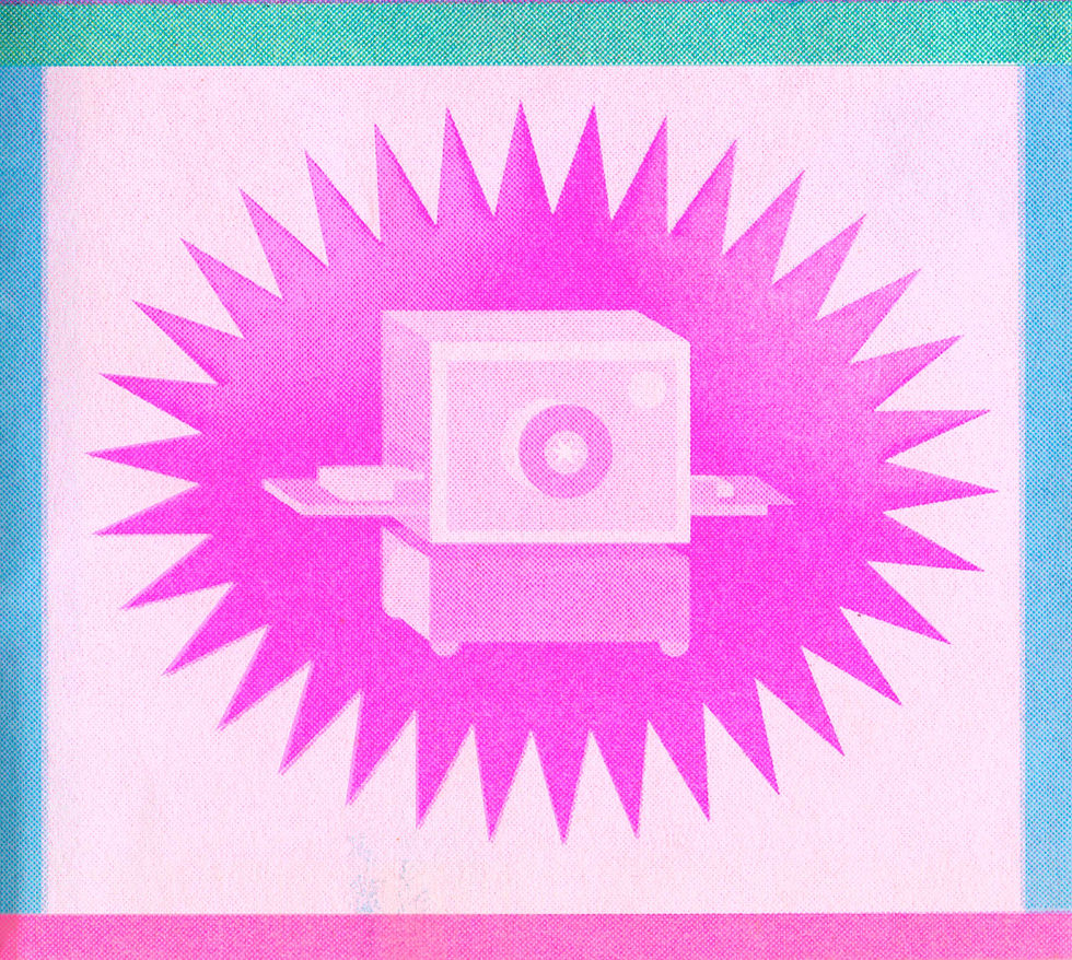
Next, go to Palette and create a palette for your project. Select the ink colors. Then, load your design onto the Canvas page. Press the Riso-fy button, and Spectrolite will immediately show you what your design will look like in the chosen ink colors. You can also compare multiple palettes side by side. This way, you can quickly find the most beautiful color combination without having to make a lot of test prints. My favorite riso colors are fluorescent pink, fluorescent orange, and yellow, so I often pick one of those to go with it. For this poster, I chose fluorescent pink, fluorescent orange, and aqua!

On the right side of the screen, you also see overprint charts: images showing how each combination of inks interacts with one another. If you click on a color swatch, Spectrolite copies the hex code to your clipboard. Handy to use as a reference in your design program, such as Photoshop, InDesign, or Illustrator!
When you are satisfied, export the separated files as PDF, PSD, or PNG, which are then completely ready to print.

This is the final result of this poster! As you can see, the colors are a tiny bit different than on the screen, but that's what makes it so fun.
Halftone and posterize
Spectrolite also has an option to halftone your design (convert it to a dot raster, like you see in screen printing) or posterize it (flat color areas without gradations). Both effects are very characteristic of the riso vibes, and you simply set them in the app before exporting.


Here you can clearly see the differences between what the halftone and posterize functions do. As a beginner, halftone and posterize might sound a bit abstract, so I will briefly explain what they do and when you would use them.
Halftone It is something you have probably seen before without knowing what it was called. If you look very closely at a newspaper photo or an old comic book, you will see that the image actually consists of a lot of small dots. Light areas have small dots with a lot of white around them, while dark areas have large dots that are close together. That is halftone! It is the way traditional printing techniques mimic shades of gray and color transitions, because a printing press cannot produce "light gray," only ink or no ink.
It works exactly the same way with riso. Without halftone, a gray area in your file results in somewhat vague, grainy ink coverage. With halftone, Spectrolite converts those same gray tones into a neat dot raster, which produces a much sharper and more distinctive effect.
In Spectrolite, you can also adjust the size of the dots. Small dots produce a finer, more detailed image. Large dots give a more pronounced, graphic look. The risograph already works with halftone-like dots by default, so adding this extra is not strictly necessary.
Posterize is something completely different. Instead of dots, Posterize reduces your design to a limited number of flat color areas. Gradients and color transitions disappear, and what remains are hard, clear areas of light and dark. It is as if your design has been converted into a stencil. It creates a very clean, graphic effect.
This works especially well if your print is already somewhat graphic or illustrative. Do you have a photo with many color gradients and want to create a flat, almost poster-like version of it? Then Posterize is quite handy. It gives your print a very different atmosphere than Halftone. Less retro newspaper, more graphic Andy Warhol-esque planes.
And the disadvantages of Spectrolite?
The automatic separation is not always 100% precise. Even if you have used the exact hex code of an ink color in your design, a small trace of another color can sometimes creep into the separation. In practice, you almost never see this, but it is good to know. So, not a big problem :)
Furthermore, Spectrolite works with a maximum of four ink layers per project. Do you want more colors? Then you have to continue manually. This can be done using the Photoshop method, for example. However, this is usually not necessary; a risograph print with more than 4 layers can sometimes be quite impractical.
3: Separating with spot colors in InDesign
Are you working on a zine, booklet, or poster in InDesign? Then working with spot colors is a great way to prepare your riso file. It might sound complicated, but once you understand how it works, it is not very difficult.
What exactly is a spot color?
In InDesign, you can work with colors in two ways: with process colors (CMYK, where colors are composed of cyan, magenta, yellow, and black) or with spot colors. A spot color is a separate, unique color. In other words, a color that is not mixed but exists as itself.
This is very handy for Riso printing. A Riso printer prints using separate, distinct inks, rather than CMYK mixtures. By working with spot colors in InDesign, you tell the software: "this part belongs to ink color A, and this part to ink color B." InDesign then keeps those two colors neatly separated, so that you can export them separately as print files. So, in short: every spot color in your file becomes a single separate layer on the Riso printer. This ensures that you can consciously work with the layers and play with transparencies!
Create a spot color
Open the Swatches panel via Window > Color > Swatches. Click the small menu icon (four lines) in the upper right corner and choose New color swatch.
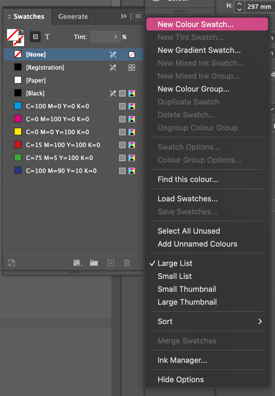
A window opens with a few options. This is the most important one: set the Color Type to Spot Colors. Is it set to "Process Color"? Then it won't work properly for risograph, so you want to avoid that.
Next, give the color a clear name. Simply use the name of the riso ink color you are going to print, for example "Riso Fluor Pink" or "Riso Aqua Blue". You will see that name in your export files later, so the clearer, the better.
Then choose a color that is visually somewhat close. It doesn't have to match perfectly; it is purely so that you have a reasonable idea on your screen of what your design looks like. The actual color is determined by the riso ink, not your screen. Click OK and repeat this for every ink color you want to use in your print.

If you do want to use the exact color codes of the Riso inks, you can find them at https://stencil.wiki/wiki/Category:Riso_inks !
Assign colors to your elements
Now that you have created spot colors, you can assign them to anything in your design. Select an object, a shape, or a piece of text, and click on the corresponding spot color in the Swatches panel. It is that simple! Anything that needs to be printed in fluorescent pink gets Spot Color fluorescent pink riso. Everything for green gets Spot Color green riso. This way, you build your design like a kind of digital version of the individual drums in the riso printer. Do you want part of your design in a lighter shade of a spot color? That is easily done! Simply lower the opacity in the appearance panel to, for example, 50% or 30%. On the riso printer, this translates to a lighter ink density, exactly how grayscale tones work in Photoshop, for instance.

Photos and illustrations as spot color
Placed photos or Photoshop images work slightly differently. InDesign cannot simply assign a color image to a spot color. To do this, you must first convert the image to grayscale in Photoshop and invert the colors (Image > Mode > Grayscale. Then CTRL/Command i) and save. If you then place that grayscale image into InDesign, you can assign it to a spot color, so it will print entirely in your chosen riso ink color.
Overprinting: colors layered on top of each other
With risograph printing, you layer colors on top of each other, and those colors blend on the paper. But by default, InDesign simply lets the top color cover the bottom one, as if there were a white area behind it. That is not what you want.
The solution is Multiply. Select the object that lies on top of another, open Window > Effects, and set the blending mode to Multiply. This causes InDesign to treat white as transparent, and you can already see on your screen how the two inks react to each other on paper. Of course, it always remains a bit of a surprise how the final print will turn out, but this way there are no big surprises!
Check everything with the Separation Previewer
Before exporting, you want to check if everything is set up correctly. To do this, use the Separation Previewer, which can be found via Window > Output > Separation Previewer.
Set the view to Separations and uncheck the eye icons for Cyan, Magenta, Yellow, and Black. What remains are only your own spot colors. Click on them one by one to see exactly which elements are on that color layer. Is something on the wrong layer? You will see it here immediately and can adjust it quickly.


Export as PDF
If everything is correct, go to File > Export and select Adobe PDF (Print). Pay close attention: go to the Output tab and set the color conversion to No color conversion. This is very important. Many standard PDF settings automatically convert your spot colors to CMYK, and then you lose all your careful separation. With "No color conversion," the spot colors simply remain spot colors in the PDF file.

Export grayscale separations
For the final print files, you need a grayscale file for each ink color. And that involves a small detour: not via Export, but via File > Print.
Select Adobe PostScript file (Mac) or Adobe PDF (Windows) as the printer. Go to the Output tab and set it to Separations. Under ink options, turn on only the spot color you want to export for this file; turn off all other inks (including the CMYK colors). Press Print and save the file.

Repeat this for each spot color separately. You then need to open these PostScript files, which will convert them to PDF. This way, you get a separate grayscale file for each ink color, with the name of the spot color neatly listed at the top of the page. Ready to print!
Some more handy tips
Always name your files including the color name, such as poster-fluorescent pink and poster-aqua blue.pdf. This way, you know exactly which file belongs to which ink.
Does your design extend to the edge of the paper? Then add at least 3 mm bleed beyond the cutting size. Set this via File > Document Settings > Bleed.
Always export as PDF, never as JPG or PNG. PDF retains all quality and color information exactly as you have set it.
These were three different ways to separate your colors. Personally, I prefer using Spectrolite, because I like to use the direct colors of the drums and make extensive use of photos. Happy printing!


Comments